

How to Use White to Brighten a Dark Bathroom
Do you have a dark room in your home?
Have you dreamed of a light, bright room despite lack of light or strong, saturated wall colors?
When we first moved into our home seventeen years ago, I immediately set to decorating our twin girls’ bedrooms and bath.

This was the first in a long list of projects that we took on before finally getting to our beloved Kitchen Renovation.
I prioritized this because fourth grade is a LOUSY time for kids to have to move..
The walls of their shared bathroom were beige.
Not cool when you are ten.
So, like any mother who wants to encourage the colorful creativity of her children, I let them pick the color.
Big mistake. For me at least.
Turquoise. They chose the most INTENSE shade of turquoise that screamed “Scrubs on Steroids.”
Before I could take back my offer and hand them a coloring book, my husband and the girls were happily painting the vanity and shower areas the chosen turquoise.

While this was not my cup of tea, the girls were thrilled with the color and lived happily through years of bathroom use getting ready for school, overnight sleepovers, bickering over clothes, getting ready for proms…
…all through a turquoise haze. There was nothing to break it up. Just turquoise.
Later, once they hit college, they admitted that the turquoise got a little old as they got a little older. Ah, the wisdom of older eyes!
Now that we are empty nesters, I can paint anything whatever color I want.
And, despite the current trend of layered whites and neutrals, I love color! Deep, saturated color!
I’m not giving up color, so here is how I kept the bathroom light and bright even with dark color on the walls.
The Vanity
- I chose to wallpaper this area because it is separate from the shower room (not as much moisture) and, well, I just LOVE wallpaper! Enter navy blue wallpaper with WHITE flowers.
- When walls are a dark color, choose finishes that are light and bright. In this case, we changed outdated, beige floor tiles for fresh, grey, wood-like vinyl planks. Orangey wood trim was painted crisp Sherwin Williams “Pure WHITE” and the vanity (same orangey wood) was exchanged for a WHITE vanity with a marble top.
- Reflective chrome lighting fixtures brought in some much-needed shine and made the wallpaper pop. If you like “Pops of Color”, check out one of my blog posts that take a look at this very idea! Oh, and here is another one with My 10 Favorite Pops of Red!


The Shower/Toilet Room
Hold on to your colorful hat…we painted the connected shower/toilet room a deep, rich, saturated NAVY BLUE! I had the paint store scan the navy background of the wallpaper in the vanity area and then lighten it slightly. We used a semi-gloss finish so there is actually light reflection when you look into the room. Yet, I was still a little taken aback. The room was still VERY dark. (Cue ominous music…!) And, for that matter, BORING! (More ominous music!)
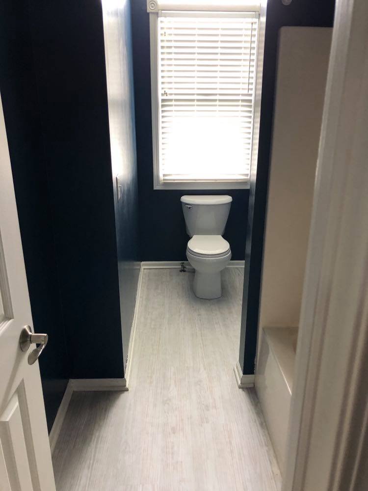
Again, WHITE came to the rescue! Painting the wood trim WHITE, installing a new WHITE toilet, and continuing the grey vinyl floor planking worked wonders!
- The beige shower insert was a little dingy from years of use so we used an AMAZING Drill Brush that attached directly onto our drill and took care of the problem. So, even though beige, it is a CLEAN beige and the next best thing to WHITE. (and will be covered by the shower curtain.)
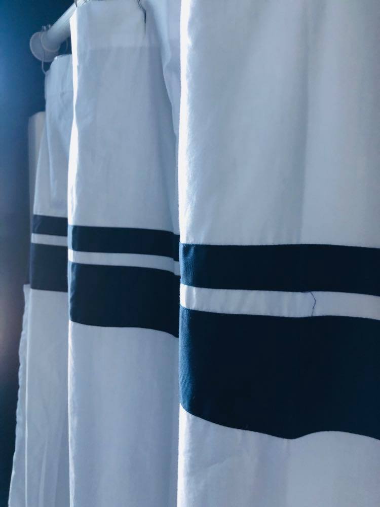
- Speaking of shower curtains…I found a crisp, WHITE Shower Curtain with navy trim to cover the beige shower insert and break up the navy walls. I love this shower curtain because it feels like a luxury hotel curtain!
- While the grey vinyl planks do brighten the space, a WHITE bath mat was in order.
- My last step was to add just a touch of personality through wall art, again to break up the navy blue walls. I had a collection of black framed The New Yorker magazine art work that we had picked up from street vendors while visiting our NYC daughter. The WHITEish mattes helped to bring some interest and brightness to the room. However, STILL TOO DARK!
The wall art does help but the frames seem to disappear into the blue paint.

A quick spritz of WHITE spray paint on the frames does the trick. Now the WHITE frames give contrast to the navy blue and even the cream colored mattes of the artwork looks brighter!
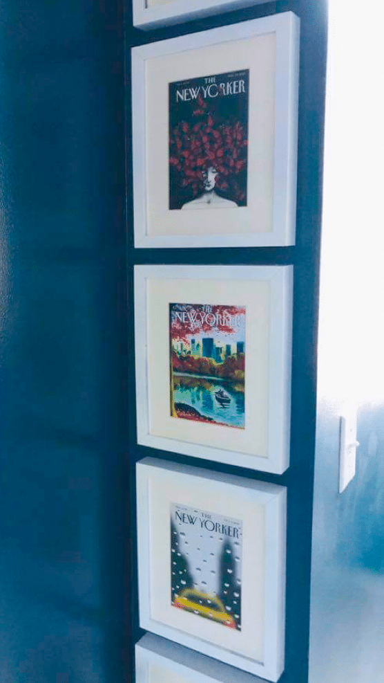
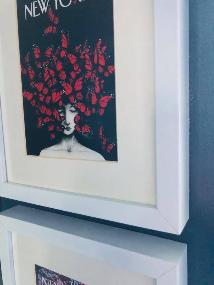
Here are a couple of my favorite New Yorker magazine covers. They come in a variety of sizes and are so INTERESTING to look at! Display in a white frame and add a little “urban” to your home! (You can even find The New Yorker magazine artwork in puzzle form. Still fun to frame!)


An easy solution to using dark wall color in your home is surrounding it with the crisp contrast of WHITE. Whether through trim, lighting, wall art, or accessories, the WHITE will serve to make the wall color even richer while elevating the brightness of the room. So, go for the dark tones….
with the added magic of WHITE!

Cheers!

Disclaimer: This post contains affiliate links.
Your bathroom renovation is beautiful, Missy! I love your wallpaper!!!
Thanks, Stacey! It is definitely better than the original turquoise! Hope all is well with you and your summer is off to a great start! Thanks so much for reading!